A galaxy of signals and silos

Viral pathogen genome researcher, Theo Sanderson, has created a map of 3million+ Bluesky users that visualizes simple, publicly available user data, and it's exquisite.
What first stunned me was, that's the way I imagine data in my head. Though, in my head the data is dynamic – animated, three-dimensional. I can picture how different filters could change the form of the data, and I wonder what an army of bots would look like moving through a nebulae of users. Would it leave a wake of disordered users, or would it look more like a virus spreading?
The map looks like a galaxy, and why wouldn't it, the universe is literally made up of energy and information. Data is just information, add energy via visualization and you have what looks like a universe. My god I bet Meta and Palantir have insane visualization software. Governments too. No kidding they need a gazillion data centres, right? If they could track and predict every citizen dynamically what would stop them from doing that? Predict, control, subdue. But I digress...
Did you know when a black hole collapses it releases its energy but holds the information, and some theories suggest the information becomes a "white hole", which is a miniscule speck floating in space that, after billions of such collapses, has accumulated into dark matter clouds? Dark matter might be seas of dead black holes, which is pretty frickin neat to think about.
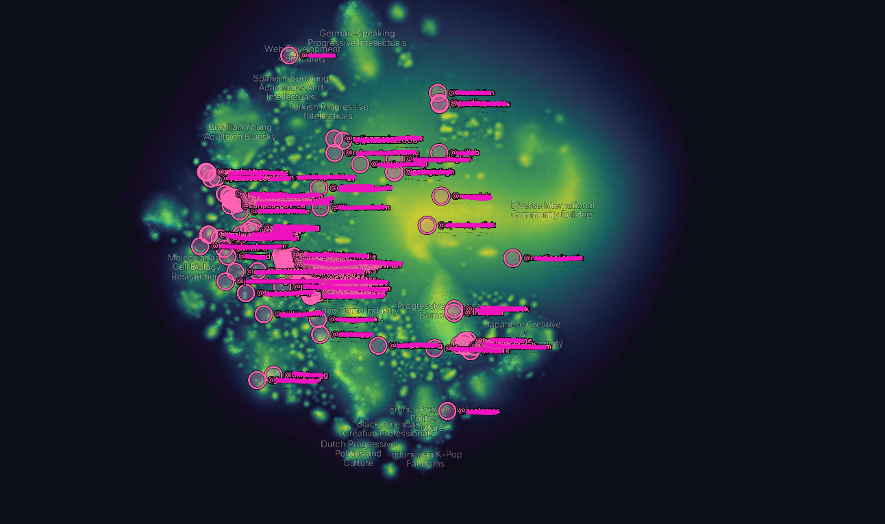
Anyway back to this map. Like my god what a beaut. I spent some time exploring the UI and zooming-in and out, then I searched my handle and was pleased with where I found myself – no silos, nestled in the glowy fog above the swoosh of diverse creatives and community-builders (who all probably joined the app early as hopeful creators and communicators but ditched when reach wasn't there, hence the yellow, which indicates low-activity, I think). I seem to be in the group of users that just floats around doing their own thing, which is indeed a characteristic of certain neurodivergencies. Parallel play is kind of our thing bebs, you all go on and do your clubs.
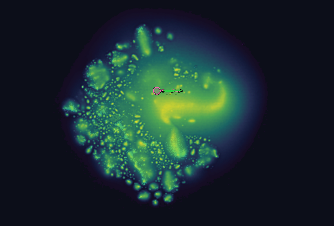
The bubbles really fascinate me tho.
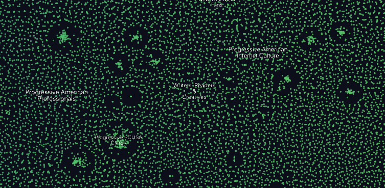
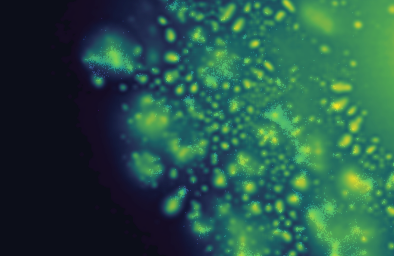
Two screenshots showing a zoomed-in view of the glowing regions comprised of individual user nodes. The left image is very zoomed-in, the right is fully zoomed-out.
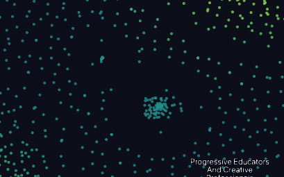
Zoomed-in, they're groups of friends, sports teams, colleague groups – users who all joined at the same time and follow each other. One was a Pedro Pascal fan club:
Zoomed-out, the bubbles are nebulas of commonalities – Theo's LLM pulled from user bios to generate community labels that consolidated them into shared interests and identities. It seems conformity is actually pretty easy to measure through data, so those nebulas are likely quite conformist within their cultural boundaries. I find this so interesting.

The data he used was public and relatively simple: followers, bios, and dates of activity. So we see shared interests, identities and recency of activity. I think blue is engagement (as opposed to last active - yellow), so the less-engaged users create faded blue halos around the nebulae of shared interests and identities. That's just a guess, though. I have so many questions for Theo!
It's kind of like seeing an image of Bluesky's "big bang"; like the early adopters flew in and SPLAT- a blobby explosion of bubbles/communities.
And that thing that looks like a cyst? It's so wild – that's "Progressive American Democrats" and the accounts within all share extremely similar content – which is why it's such a well-formed shape. And like, the entire map is progressive and "left"-identifying, so what sets the Progressive American Democrats apart (not to be confused with the American Democratic Progressives, or The People's Front of Judea), is the conformity of the content. So wild to see it as a literal bubble. It would make sense that an effect of ideology would be smoother definition. It made me reflect on how many voices from that bubble I actually need in my feed if they're all saying the same thing. Not that I don't want to hear that perspective, but I just don't need it on repeat drowning out the other signals.
Then I did comparisons between the distribution of my followers and who I follow, and found the areas I could diversify in terms of where I was getting information. I was happy to see my followers came from all across the map – I take that to mean I'm somewhat relevant to a diverse range of perspectives, which is nice to think about.
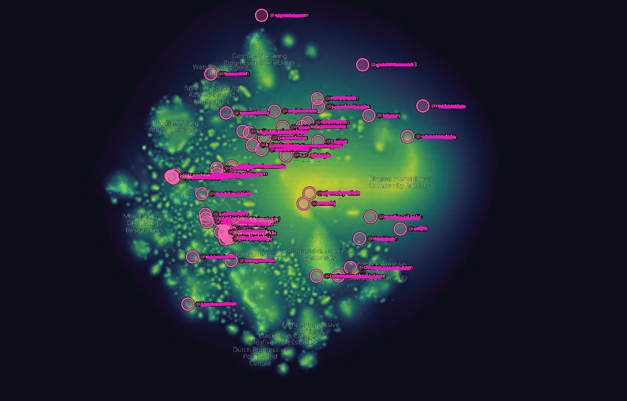
And then I mapped who I was following to find any critical blind spots:
Right away I could see there was a heavy concentration on "Irreverent Internet Comedians" (no pressure guys), but I also noticed a high concentration in American Media Figures, which I thinned out and spread into different tech-media, Canadian and European nebulas. I also poked around my own regions to find users who seemed my speed, and I did find a couple!
The data has always been right there, completely public, but being able to see it tells us so much more about ourselves. Data is actually really beautiful when it isn't being brokered by unregulated, rabid capitalists. Meta's algorithms are probably like sorters during a potato harvest, bumping us into our respective tracks. God the data they have must be beyond, especially if their third parties include behavioural data from OpenAI, video games, the health sector, security firms... and we all know they stopped giving a shit about data privacy after the election right? Nevermind Zuckerberg had already payed out over 11 billion in violations by that point, so yeah Instagram and Facebook don't give a fuck about privacy anymore, fyis.
Anyway, judging from the comments on Theo's post, the public is in desperate need of some data literacy. His visualization is benign, random brokers had that data the moment we chose public profiles on a social media site. And what can be done with data now, especially with AI processing - we need to understand this shit because the capitalist class is taking all our data, via apps, bots and algorithms, and they're banking on us giving it for free, so they can use it to predict and regulate our behaviour. We can still opt out, friends. It might not always be so.
I wonder what would happen if we all intentionally diversified our networks? Our bubbles prevent clear information from getting through to other progressives. Clean and direct flows of information will be important in the coming years. When those times come and we need to distribute information quickly and clearly, we'll need clean lines. I'm not being hyperbolic when I say it's up to us to build those lines by breaking out of our bubbles and diversifying the voices in our online and real-world communities.
Our silos no longer serve us. We have to do better. Otherwise let's just go back to tin cans and string please.
UPDATE: Upon further reflection I think this map shows the formation of mass digital dementia. Well fuck.